Using the Health Network Summary Dashboard
Overview
The Health Network Summary Dashboard provides data regarding patients, volume, Case Mix Index (CMI) ALOS, and margin analysis to help you view and manage performance and identify areas of improvement.
Opening the dashboard
To open the dashboard:
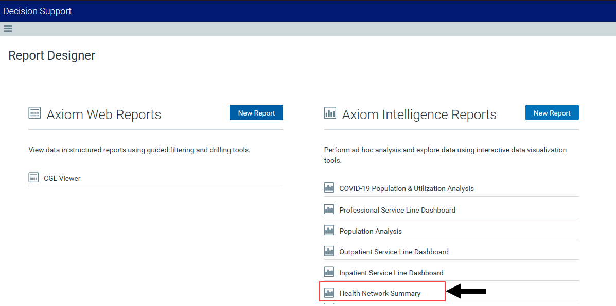
- Open Axiom Report Designer in the Web Client.
-
In the Axiom Intelligence Reports section, click Health Network Summary.

Click image to view full size
Navigating the dashboard
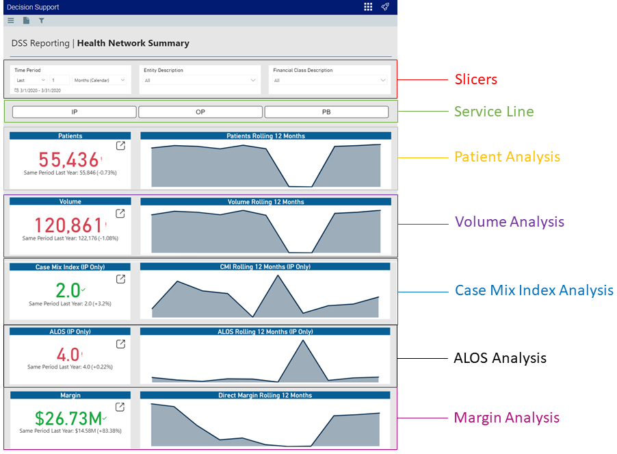
The Health Network Summary page serves as the main home page for the dashboard and includes the following sections:
Click image to view full size
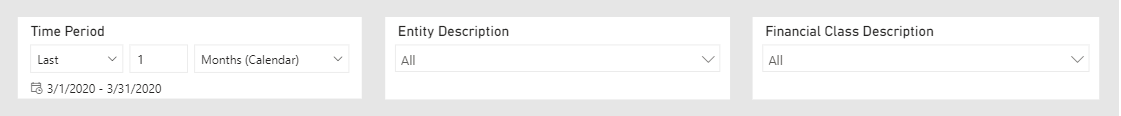
Slicers
This section allows you to filter data by time (days, weeks, months, years), entity, and financial class. From the slicer drop-downs, you can select a combination of the available options to select the parameters to include in the views.
Click image to view full size
Service Line Selector
This section allows you to view the dashboard metrics by service line type. When you click a service line button, the KPI data changes dynamically specific to that service line. To view the data for all the service lines again, click the service line button again to disengage the filter.

Click image to view full size
Patient Analysis
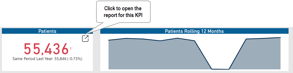
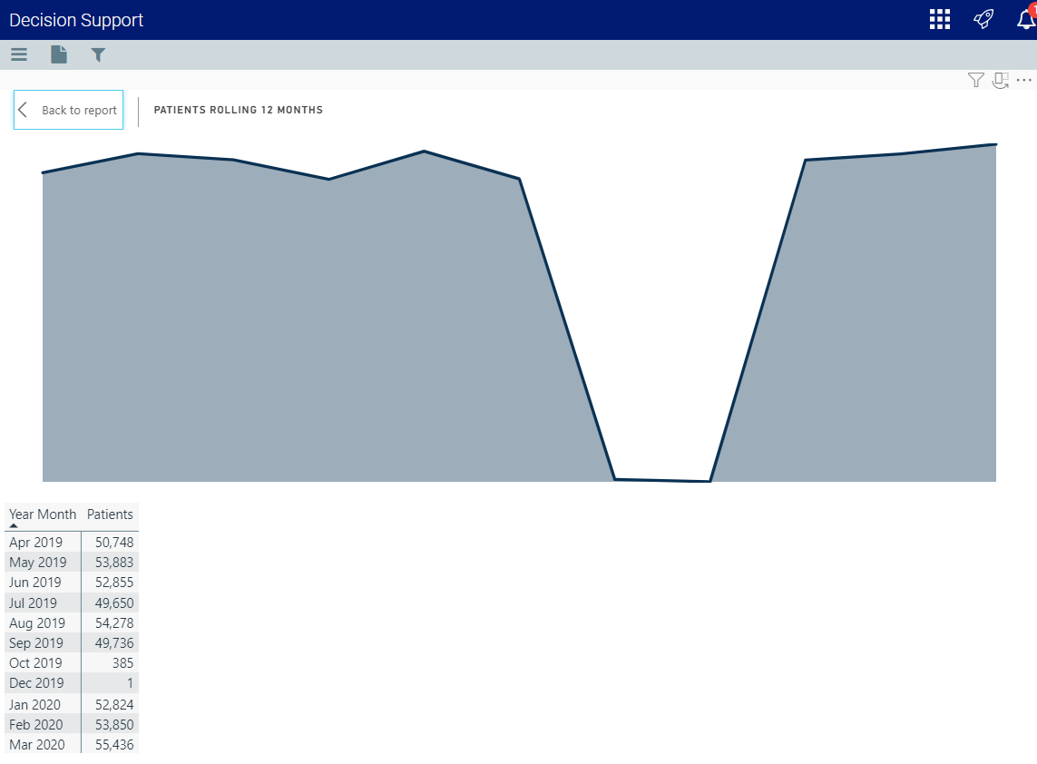
The Patients KPI card shows the number of patients based on the criteria selected in the Slicer and Service Line Selector sections, including the percentage of change over the same period the previous year. The Patients Rolling 12 Months card displays a graph of the number of patients over a rolling 12-month period. Hover your cursor over the graph to see the number of patients for a specific month. To open the report that includes the data behind this KPI, click the drill icon in the Patients card. For more information on this report, see Patient Analysis report.
Click image to view full size
Volume Analysis
The Volume KPI card shows the case volume based on the criteria selected in the Slicer and Service Line Selector sections, including the percentage of change over the same period the previous year. The Volume Rolling 12 Months card displays a graph of the number of cases over a rolling 12-month period. Hover your cursor over the graph to see the number of cases for a specific month. To open the report that includes the data behind this KPI, click the drill icon in the Volume card. For more information, see Volume Analysis report.
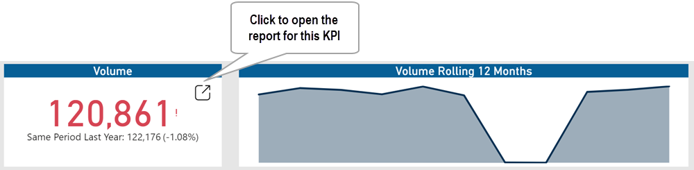
Click image to view full size
Case Mix Index Analysis
The Case Mix Index KPI card shows the Case Mix Index (CMI) for In Patient based on the criteria selected in the Slicer, including the percentage of change over the same period the previous year. The CMI Rolling 12 Months card displays a graph of CMI data over a rolling 12-month period. Hover your cursor over the graph to see the CMI data for a specific month. To open the report that includes the data behind this KPI, click the drill icon in the Case Mix Index card. For more information, see Case Mix Index Analysis report.
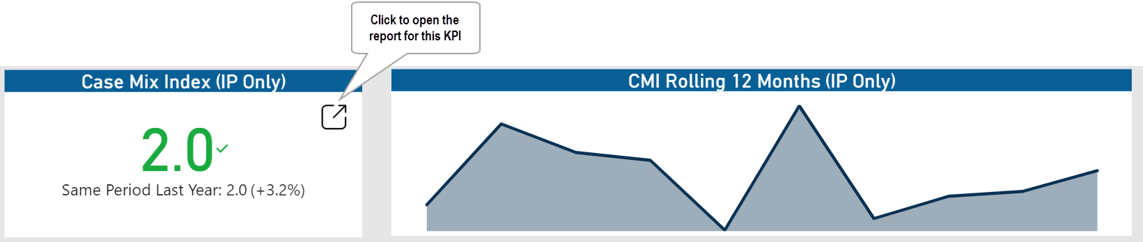
Click image to view full size
ALOS Analysis
The ALOS KPI card shows the Average Length of Stay (ALOS) for In Patient based on the criteria selected in the Slicer, including the percentage of change over the same period the previous year. The ALOS Rolling 12 Months card displays a graph of the ALOS for patients over a rolling 12-month period. Hover your cursor over the graph to see the days for a specific month. To open the report that includes the data behind this KPI, click the drill icon in the ALOS card. For more information, see ALOS Analysis report.
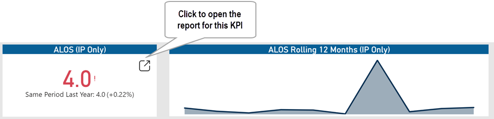
Click image to view full size
Margin Analysis
The Margin KPI card shows the profit margin based on the criteria selected in the Slicer and Service Line Selector sections, including the percentage of change over the same period the previous year. The Direct Margin Rolling 12 Months card displays a graph of the direct margin dollars over a rolling 12-month period. Hover your cursor over the graph to see the amount for a specific month. To open the report that includes the data behind this KPI, click the drill icon in the Margin card. For more information, see Margin Analysis report.
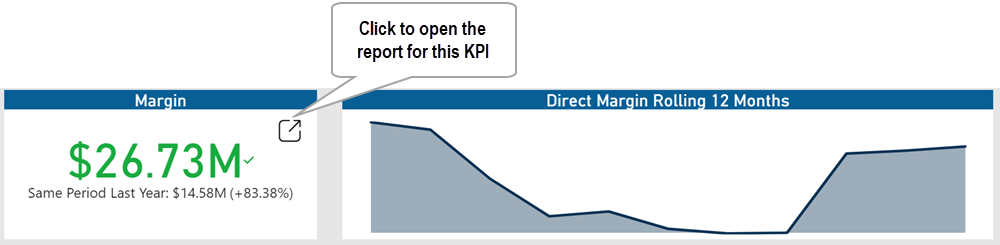
Click image to view full size
Viewing data in table format
You can view the underlying data for visualization graphs and tables by right-clicking the image or table, and clicking Show as a table. A data table displays underneath the visualization graphic or table. To return to the dashboard, click Back to report in the upper left corner of the page.
Click image to view full size
